Nathaniel Graham
2018-10-07 21:06:10 UTC
ngraham created this revision.
ngraham added reviewers: VDG, Plasma.
Herald added a project: Plasma.
Herald added a subscriber: plasma-devel.
ngraham requested review of this revision.
REVISION SUMMARY
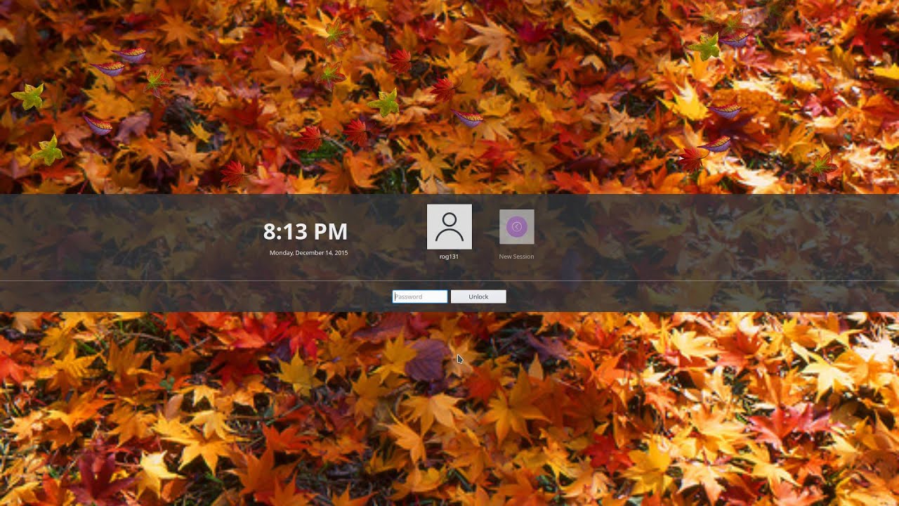
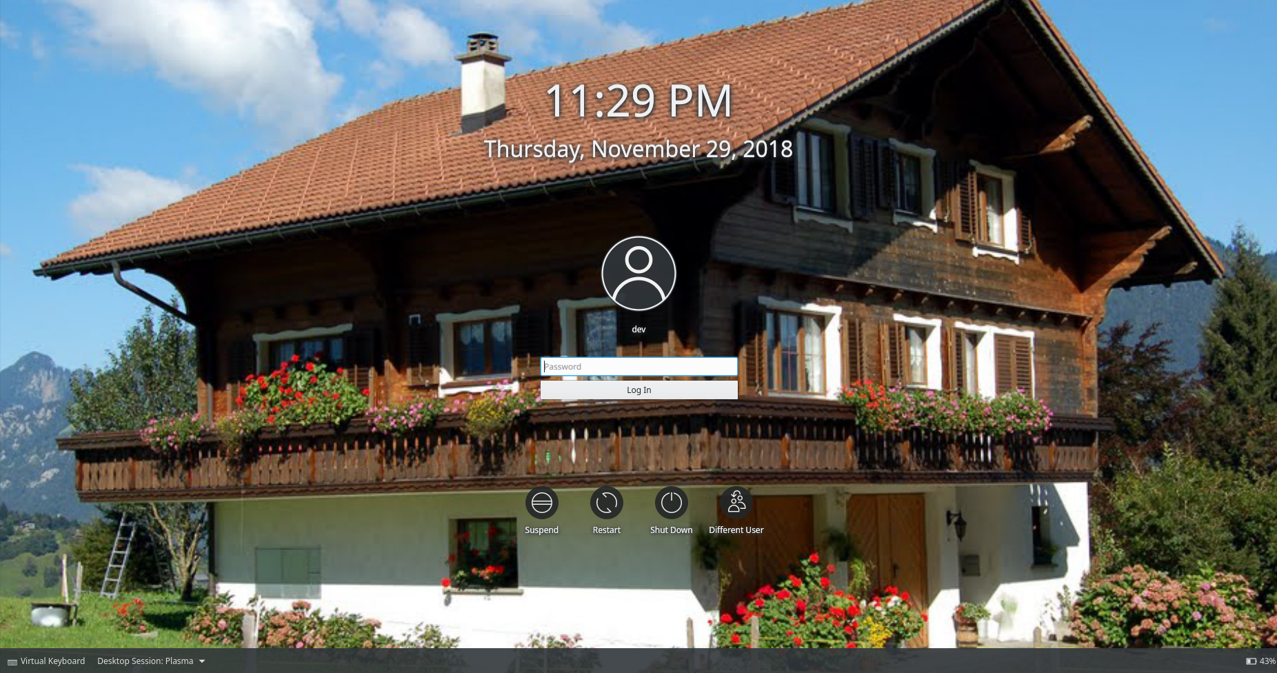
This patch adjusts the Breeze SDDM theme to remove the semi-permanently-blurred background, which has not been especially popular.
In its place, it improves the contrast and readability of the UI elements that reviously required the blur in order to be visible enough with all backgrounds.
BUG: 398115
FIXED-IN; 5.15.0
Closes T9658 <https://phabricator.kde.org/T9658>
TEST PLAN
[images go here]
REPOSITORY
R120 Plasma Workspace
BRANCH
tweaked-login-screen (branched from master)
REVISION DETAIL
https://phabricator.kde.org/D16031
AFFECTED FILES
lookandfeel/contents/components/SessionManagementScreen.qml
sddm-theme/Main.qml
To: ngraham, #vdg, #plasma
Cc: plasma-devel, ragreen, Pitel, ZrenBot, lesliezhai, ali-mohamed, jensreuterberg, abetts, sebas, apol, mart
ngraham added reviewers: VDG, Plasma.
Herald added a project: Plasma.
Herald added a subscriber: plasma-devel.
ngraham requested review of this revision.
REVISION SUMMARY
This patch adjusts the Breeze SDDM theme to remove the semi-permanently-blurred background, which has not been especially popular.
In its place, it improves the contrast and readability of the UI elements that reviously required the blur in order to be visible enough with all backgrounds.
BUG: 398115
FIXED-IN; 5.15.0
Closes T9658 <https://phabricator.kde.org/T9658>
TEST PLAN
[images go here]
REPOSITORY
R120 Plasma Workspace
BRANCH
tweaked-login-screen (branched from master)
REVISION DETAIL
https://phabricator.kde.org/D16031
AFFECTED FILES
lookandfeel/contents/components/SessionManagementScreen.qml
sddm-theme/Main.qml
To: ngraham, #vdg, #plasma
Cc: plasma-devel, ragreen, Pitel, ZrenBot, lesliezhai, ali-mohamed, jensreuterberg, abetts, sebas, apol, mart